
The Machine, Mapped
How a Small Network of Accounts Shapes What Millions of People See, Hear, and Believe (w/ visual maps)

Most people assume online discourse is chaotic — millions of individuals posting independently, colliding by chance.
That assumption breaks down the moment you look at the structure.
The five maps below visualize the top 250 most connected accounts in a single political discourse network. They do not analyze beliefs, motives, or ideology. They map connections — who interacts with whom, how often, and how centrally.
What emerges is not randomness, but a system: a small core of highly connected accounts, surrounded by layers of secondary relays, and then a much larger outer ring that amplifies, defends, attacks, and swarms.
This is not about intent.
It is about mechanics.
How to Read These Maps
Each circle (node) represents a single account.
Each line (edge) represents a documented connection in the dataset.
Larger circles indicate higher connectivity and centrality.
Clusters indicate repeated interaction with the same core accounts.
The maps do not claim coordination in the conspiratorial sense. They show structural dependency — how attention and influence actually move through the network.
The Big Picture
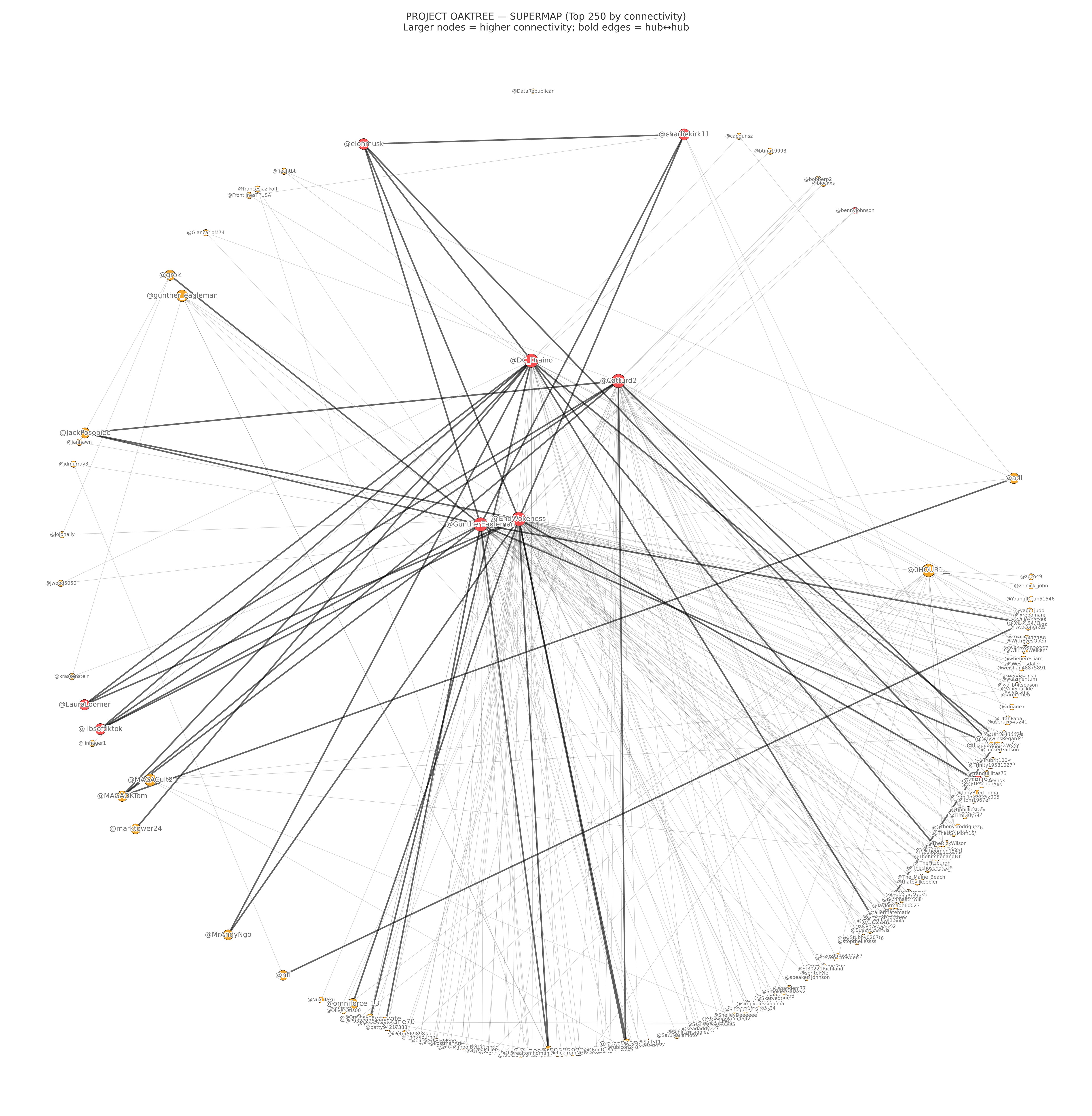
This supermap shows all 250 accounts at once.
Three things stand out immediately:
A small number of very large nodes dominate the center.
Hundreds of smaller nodes form a dense outer ring.
The boldest, darkest connections appear between the largest nodes, not randomly across the map.
This is the overall shape of the system. The maps that follow simply peel it apart layer by layer.
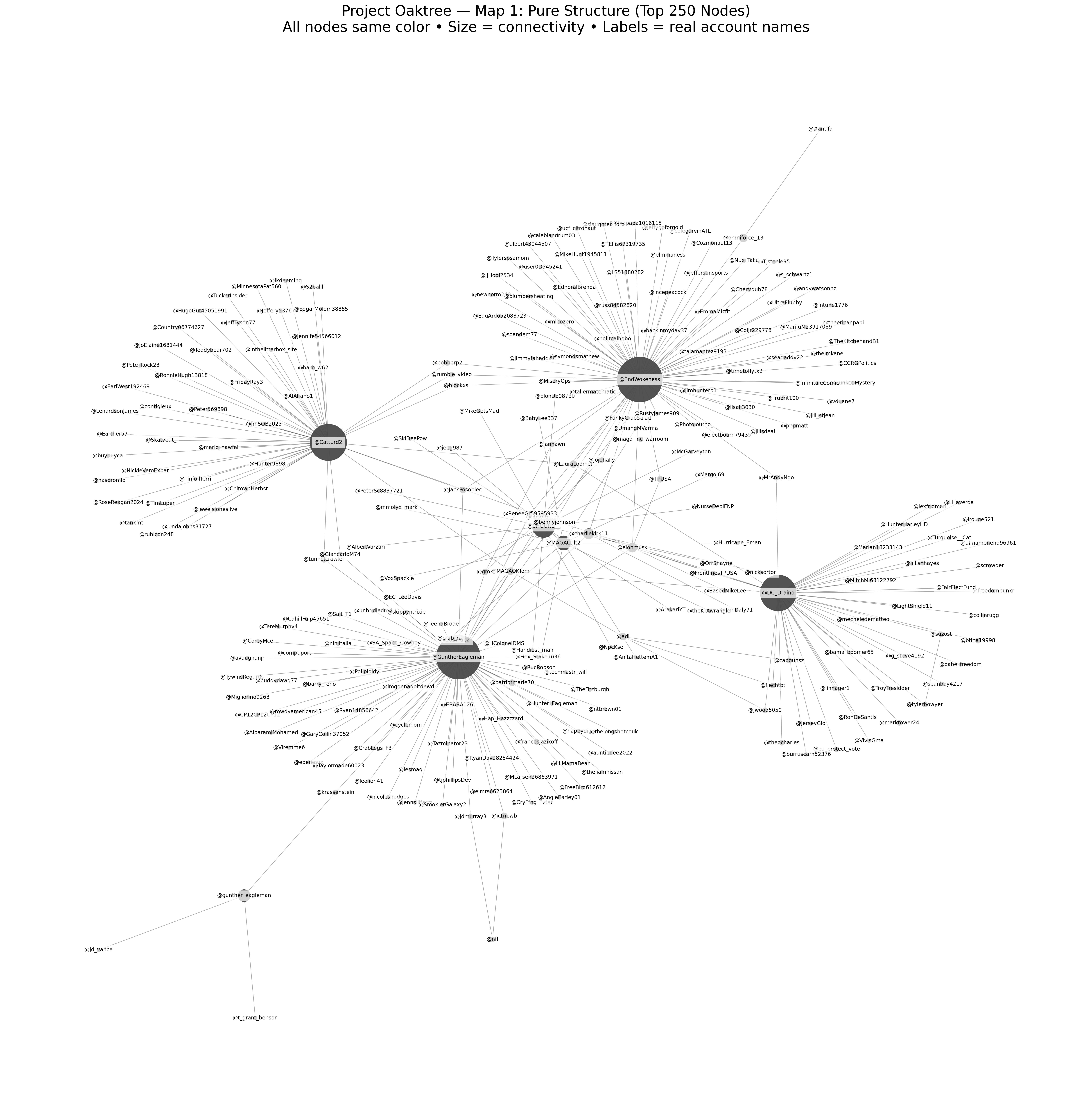
This map removes color entirely. Every node is rendered the same way. The only differences are size and position.
Even stripped of interpretation, the same names remain large and central. The same clusters remain visible. The hierarchy does not disappear.
This matters because it shows the structure exists before narrative framing. You don’t need labels or political context to see that influence is unevenly distributed.
Map 2: Centrality Tiers (Who Sits Where)
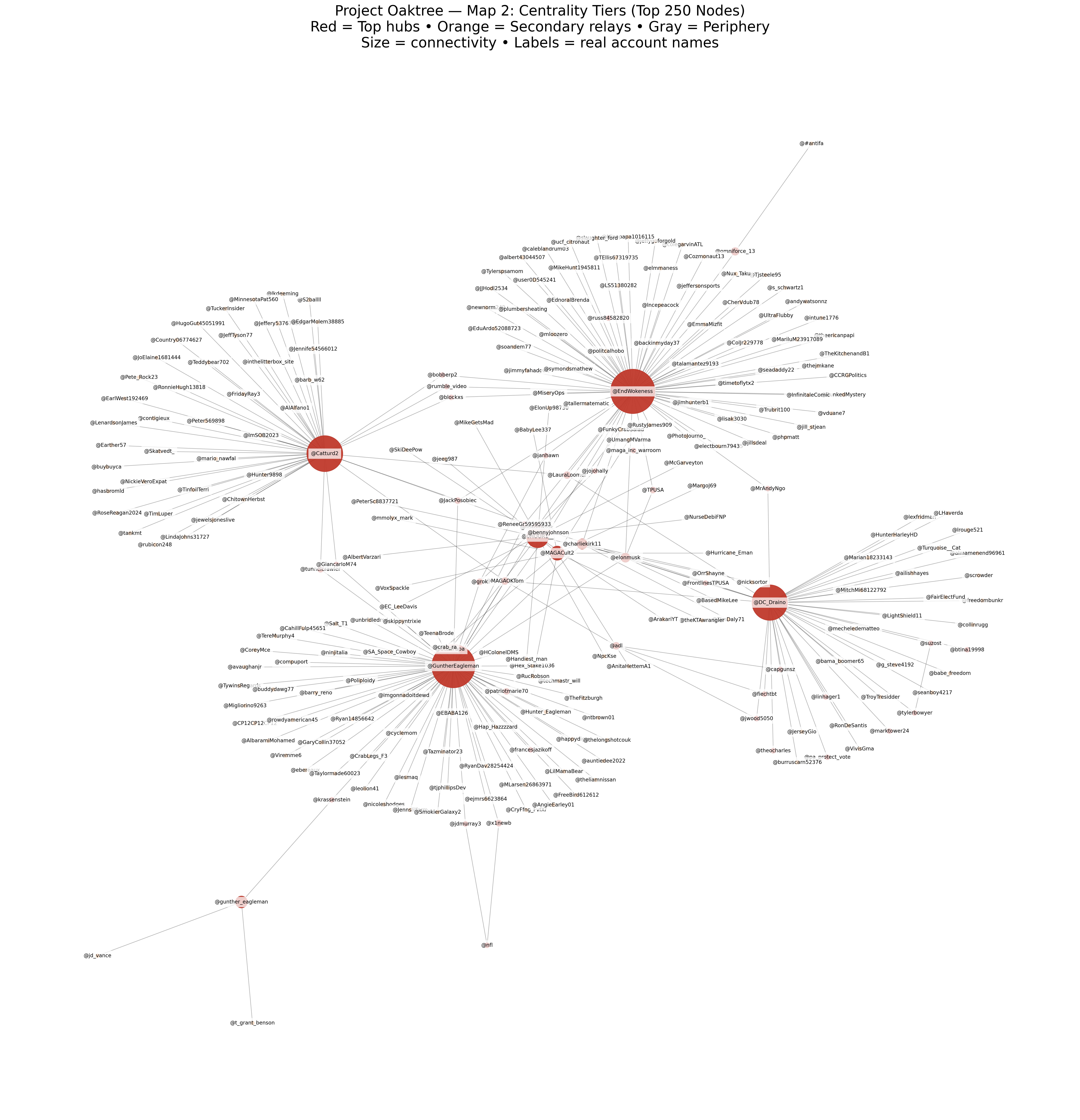
This map introduces simple color tiers based purely on connectivity.
Color key (plain English)
Red — Top hubs
Accounts with the highest centrality. These sit at major traffic intersections where attention converges.Orange — Secondary relays
Accounts that bridge hubs to the outer network and help carry narratives outward.Gray — Periphery
The largest group numerically. Individually small, but collectively powerful during swarms.
The most central hub accounts shown include:
@EndWokeness@DC_Draino@Catturd2@GuntherEagleman@MAGACult2 (Us)
These accounts appear as the largest, most central nodes in the network.
However — and this is critical — not all centrality is the same.
A Necessary Clarification About @MAGACult2
One of the red nodes, @MAGACult2, looks different from the others.
While it appears centrally located, it does not display the same dense web of outward connections seen in accounts like @EndWokeness, @DC_Draino, @Catturd2, or @GuntherEagleman.
That difference is real — and it is meaningful.
What the Maps Actually Show
The other top hubs function as distribution nodes:
Many outward connections
Clear relay and amplification paths
Structural positions consistent with narrative propagation
@MAGACult2/We, by contrast, appear as contextually central but non-distributive:It is referenced and intersected by the network
But it does not drive amplification trees or swarm cascades
It does not function as a broadcast hub
In network terms, this is the difference between:
Being central to understanding a system, and
Being central to moving messages through it
The maps reflect that distinction clearly.
If they did not, the analysis would be suspect.
Map 3: The Hub Spine (The Backbone)
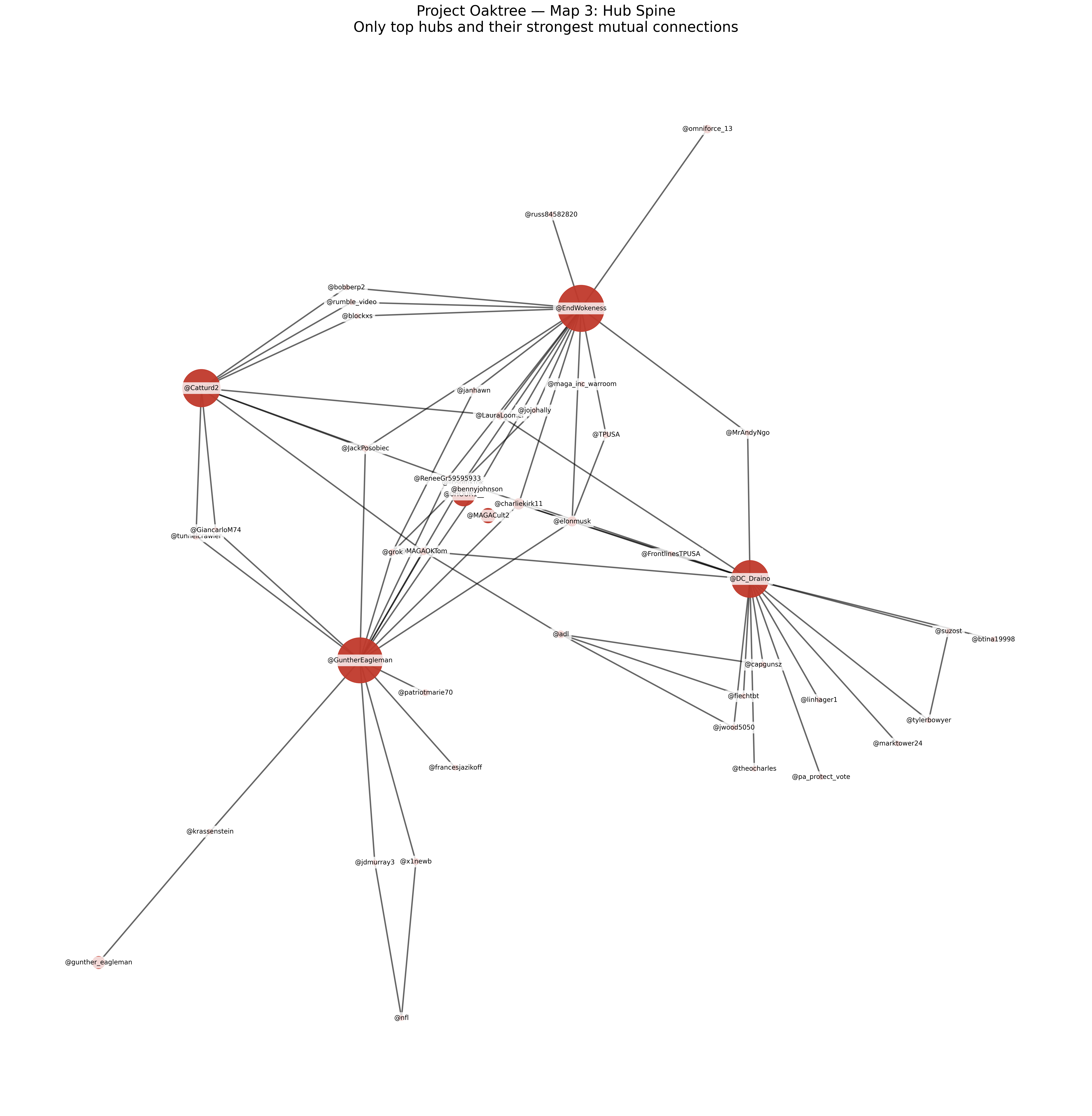
This map removes most of the periphery and isolates the strongest mutual connections among the top hubs.
What remains is the network’s backbone — the shortest paths through which narratives can move quickly between powerful accounts.
The most prominent nodes in this spine include:
@EndWokeness@DC_Draino@Catturd2@GuntherEagleman
These accounts are not isolated. They are interlinked, forming a structure that allows rapid synchronization without requiring a large number of intermediaries.
This is how narratives can shift quickly across the platform without appearing coordinated.
Map 4: Swarm Dependency (Why It Feels Like a Machine)
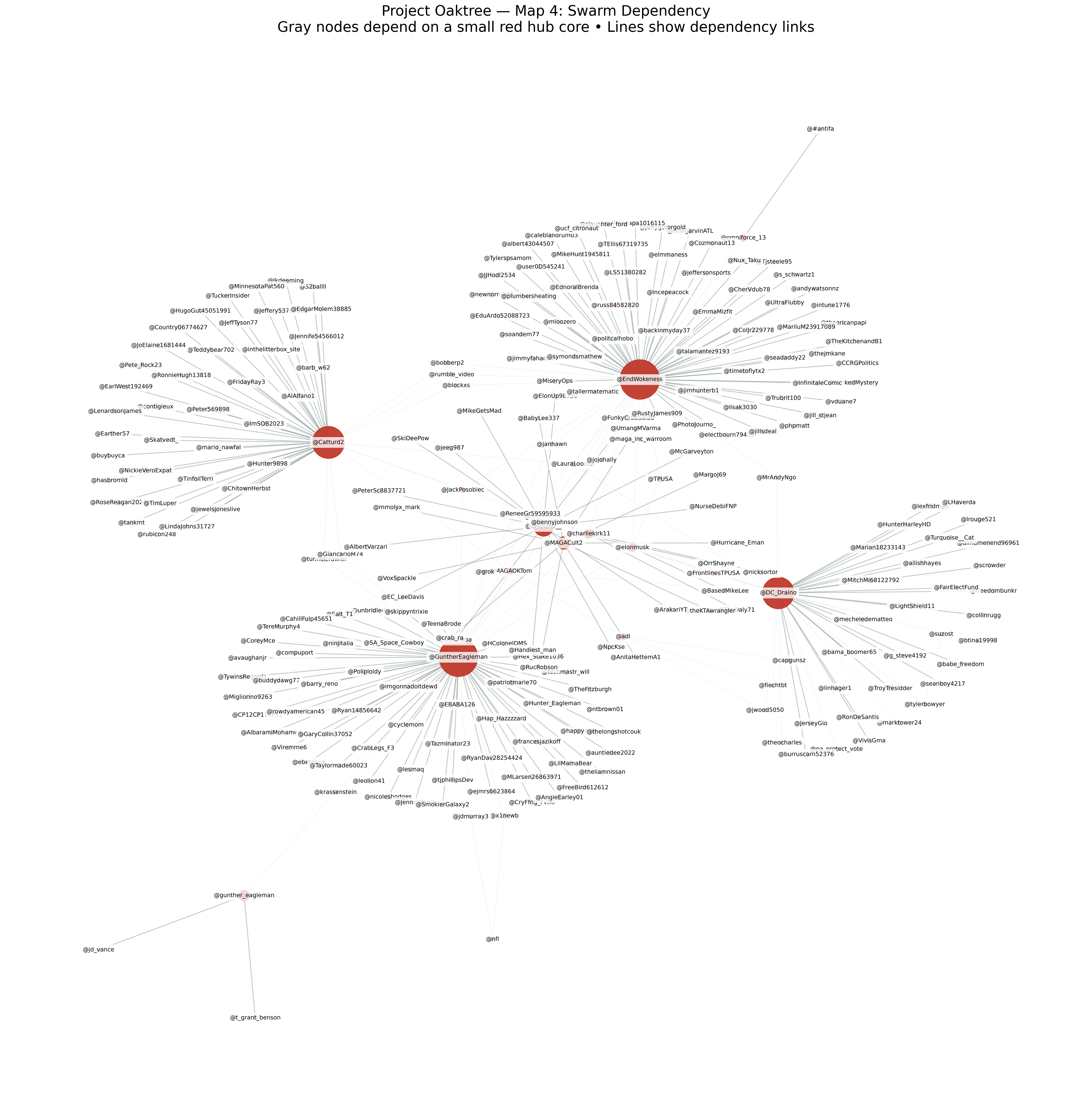
This map brings the outer ring back into focus.
Here, the gray periphery is visually shown as structurally dependent on the red hub core.
What this illustrates is a common activation pattern:
Hubs frame or signal
Relays amplify
The periphery floods replies, quotes, and mentions
This does not require explicit coordination. It only requires dependency, which is exactly what the structure shows.
This is why online confrontations can feel overwhelming and one-sided even when the number of original drivers is small.
What These Maps Demonstrate — Without Speculation
Taken together, the five maps show that:
The network is hub-driven, not flat
Influence is concentrated, not evenly distributed
The most powerful hubs are interconnected, not independent
Large swarms are structurally downstream from a small core
This explains why:
Certain narratives appear everywhere at once
The same accounts surface repeatedly during flashpoints
Pushback often triggers immediate, high-volume response
What This Analysis Does Not Claim
These maps do not assert:
A single controller
A secret command center
Identical beliefs or motives
They describe mechanics, not ideology.
And mechanics matter — because systems don’t need conspiracy to behave like machines.
Final Thought
If online discourse were truly random, these shapes would not exist.
But they do.
And once you see the structure, it becomes very difficult to unsee it.
Wow. This is interesting and important. Great work.
Wow - certainly reframes how it's seen. Very difficult to visualize from within the constant stream of messages going on. Thank you for this analysis!